Nippon Kodo's New Logo
For 450 years, we have carried forward Japan’s fragrance traditions. Today, we unveil a renewed identity - our first logo redesign in 60 years - crafted to honor our history while embracing the future.
Collaborating with Art Director Kaoru Kasai and Type Director Akira Kobayashi - whose idea it was to use a typeface in the 6th-century European calligraphy, a time when every stroke was handwritten - the logo blends subtle Japanese aesthetics with historical European craftsmanship. The new NK Purple merges our traditional red (passion) and blue (heritage), honoring the legacy of our original logo while symbolizing harmony between tradition and progress. The generous spacing in the design reflects the span of our 450-year journey and its enduring vision. Each element in the design honors the hands that came before us.
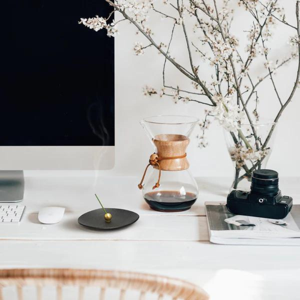
This renewal carries forward a promise: to keep sharing Japan’s incense culture through fragrances crafted with reverence, inviting new generations to find their own stories in the rising smoke.
Listening to Scent: Thank You for Joining Our KODO Sessions in Los Angeles
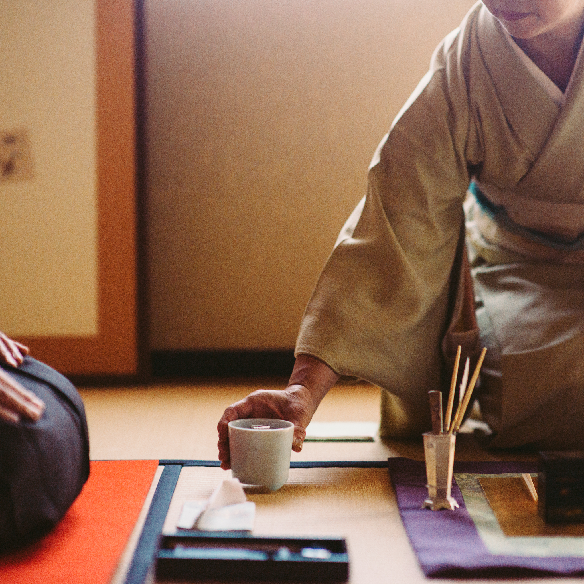
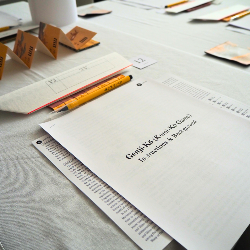
Listening to Scent: The Art of Kōdō Comes to Los Angeles - SOLD OUT!